![]()
Advocacy
Dojo (HowTo)
Reference
Markets
Museum
News
Other
![]()
Myths
Press![]()
General
Hack
Hardware
Interface
Software![]()
Standards
People
Forensics![]()
Web![]()
CodeNames
Easter Eggs
History
Innovation
Sightings![]()
Opinion![]()
Martial Arts
ITIL
Thought![]()

![]()
![]()
![]()
|
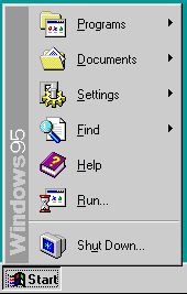
Microsoft gives us lots of ammo for examples of bad user interface. When running Windows95, the first things the users sees is bad -- the Start Menu. And it is bad for so many different reasons.
What is it for?
![]()
The first thing you should do is name something logically, so that a name alone should make things clear and obvious. With that in mind, what does the start button do? Isn't the computer already running? Why would I need to start it again?
Now the obvious reason has some history. Programmers usually include a file called "Read Me", "Run me first", or "Start here". Microsoft took the "Start here" and abbreviated it to "Start". But "Start" does not explain what it does, and new users certainly don't know, so a single word like that can give the user preconceptions (which are wrong) about what it does. This was not a good interface decision.
To make matters worse, imagine you tell a user how to shut down his Windows machine, " the first item in the start menu is the shut down". To which they immediately reply, "Why should I press the Start button to turn the computer off?" To which you can calmly respond, "Because Microsoft has a bunch of interface cretins who are lacking in any clue when it comes to good interface." Then you get labeled a Mac Bigot for stating the facts. But the point is that the name is not clear, nor is it logical by what it contains.
Apple is not perfect. The Apple menu is only a little better; so no clear label there either. But at least it is in the menu bar, so users know what it does -- it behaves like every other menu. At least their is no word like "Run" or "Go" making the meaning more ambiguous.
Looks can kill
Given that you know what a menu looks like, and that you know what a button looks like, and the start button looks like a button, and that the start button is placed next to other buttons; how would you expect the start button to behave -- like a menu or a button?
If you guessed "like a menu" then you are qualified to work for Microsoft on their "convoluted UI team". Yes, the start button looks like a button, is called a button, is placed next to buttons, but it behaves like a menu.
Behavior kills
It may look like a menu, but one of the basic reasons for putting menus near the edge of the screen is so that you can't overshoot them; in this case it means that if you are the lowest left corner, and if you click, the menu should still "popup". [Read Menu Targeting] Naturally, that would be convenient, so it does not. You have to move up and to the right to get it to work.
Prioritization
Menus are supposed to be arranged from top to bottom, because this is how people normally think -- it's logical. People expect items at the top items to be "higher" priority, or at least higher frequency (more commonly used). Items at the bottom are "lower" priority, or less frequently used.
The other reason we sort menus from top to bottom has to do with efficiency. Items at the top require the least amount of movement. Since menus pull down, the items closest to the top are the "prime" positions (requiring the least amount of motion to access). Destructive items, or seldom used items, are more often placed near the bottom of menus, because you never want to make destruction of data (work) too easy. Also because you assume that people are not destroying as often as they are creating. So prioritizing is often done by frequency of action because of efficiency.
There is a little conflict in menu ordering, having to do with "logical ordering" versus "frequency/efficiency" ordering. This is made a tad worse, since menu items are grouped -- so you have to sort with groups (not individuals menu items).
Bottoms-up
 No,
this isn't about the pose Microsoft excepts you to take when
dealing with them, as appropriate as it may be. This is
about Microsoft deciding that they should put the start
menu/button at the bottom of the screen -- and that the menu
should drop-up. (Think antigravity).
No,
this isn't about the pose Microsoft excepts you to take when
dealing with them, as appropriate as it may be. This is
about Microsoft deciding that they should put the start
menu/button at the bottom of the screen -- and that the menu
should drop-up. (Think antigravity).
But think about what that does to prioritization. The items on the bottom of the menu become the easiest to hit. The bottom items are the highest "priority" (in efficiency), but they are still the lowest priority logically (visually).
Making a bottom up menu forced a choice; should they invert your order (bottom-up) to make the machine more efficient to use -or- should they leave it hard to use but a tad more clear in visual ordering? Microsoft left it inefficient (or anti-efficient) for the sake of visualization. The better of the two bad choices. But remember, Microsoft forced this either/or decision by choosing an inverted (bottom-up) menu in the first place.
The end result is that the shutdown (the most destructive behavior possible) is the easiest to hit menu item. (Since it is the first menu item we pass over). Also remember that if you always have to move over something, then you are likely to hit it (occasionally) by accident. So they build-in a high potential for mistakes. Meanwhile, the programs menu item (the most likely reason a user is using the start menu) is the hardest item to hit item. Inverse performance tuning, you've gotta love it.
Of course the start menu is configurable (by moving the taskbar). So you can get the start button to be on the top or a side of the screen and fix the problem of bottoms up, but that doesn't change that the default behavior is bad (and most machines you "visit" will have this bad default). More than that, I keep having the taskbar pop-back to the bottom whenever I install something. So the settings don't stick well, and I feel like I am fighting the machine (as usual). Worse still, when it is at the top (or sides), many programs assume that it is at the bottom, and position their windows accordingly (causing parts to be hidden or positioned poorly). It is easier to leave it in a bad place, rather than go to war with my computer and its software.
Groupings
When doing User Interfaces you want to make groupings logical, so people can figure out what something does, by what it is around. You know like putting menus in a menu bar, or putting buttons in a button bar and not confusing them (like the start button). Or by grouping functionality in menus logically -- and so on.
The Start Menu/Button totally ignores the spirit of grouping logically. Start has shutting down the computer grouped with running programs. Changing settings grouped with finding files. Starting DOS grouped with the help system. And all these things cross grouped together (all bad grouping). Then this menu is conveniently placed away from normal menus (bad grouping). Instead it's placed in a button bar with buttons that are doing totally different things; instead of running apps, the button bar shows what apps are running and what windows are open (bad grouping). Yet grouping (or assumed grouping) implies a relationship between shutting down the machine, and bringing an application or window to the front -- thanks to Microsoft.
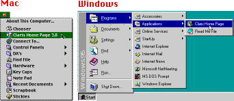
Of course I think Microsoft's problems stem from how they design UI. They see a list of features that the Mac does, and so they copy them -- but they try to be different. So they copy the Apple menu, but then make the menu pop up from the bottom (to be different). They try to throw a bunch of functionality together, and try to group all the cool Mac functions into one menu. Since they have no space for it, they throw all that in with an area on screen that they are using for something else. Not a way to design UI.
Size Matters
While this may be a minor point, I think that consistency is important. So why does Microsoft make the top level of the start have different sized icons (and line spacing) than all the other levels?

Now of course it is configurable, in a very limited way; you can make the first menu smaller, but you can't make the other menus larger. But the whole point is why the difference in the first place? These little inconsistencies are not that big a deal individually, but they add up.
Deep and wide
Menus are supposed to be as flat as possible. Hierarchies should be avoided (as much as possible). Even Microsoft says this in their own UI Guidelines (1).
(1) Yes, Microsoft does have UI Guidelines. It is just that no one pays attention to them -- especially Microsoft. And the guidelines are not very good (not kept up to date, not very specific, not enforced).
With that in mind, look at the following:
I added an Application to Windows95, and the default behavior is to bury it a few layers deep in a hierarchy as a "shortcut" to run it. The default for adding an App to the Apple menu (with an easy to execute command) is to put it at the top level (easy to get to). Which is easier -- a few needed apps, always available one layer deep, or every application in your system, buried in a hierarchy that is 3 or 4 layers deep? I don't have a lot of Apps installed on this sample PC, or the problem would be much worse (with wrapping menus and so on).
Now you can configure windows to put Apps at a higher level, and Microsoft reserves that spot for their Applications (they somehow think their Apps are better than other peoples, and shouldn't live by the same rules). And on the Mac, some people use "Recent Applications", or organize their aliases in a hierarchy (one layer deeper). But in general, you will find yourself going "deep and wide" in windows, far more often than on the Mac.
Running frequently used Apps on the Mac is usually easy and fast because not every App is installed in the Apple Menu Items, only frequently executed items. This means that I don't have to play dodge-ball around 400 programs that I don't care about. Furthermore, I don't have to tunnel 2, 3 or 4 layers into some hierarchy, every time I access them. If I'm having to go through all that to run frequently used programs, I might as well use the directory hierarchy, file browser (or the popup windows on the Mac). So what good is a shortcut menu, when it isn't very short to use it?
Contextual Menu?
Right-clicking the mouse, behaves differently for the start button compared to all other buttons. Just look at the following:
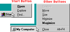
The behaviors (commands) available for the start aren't bad (and are actually useful) -- but it is "different" from everything else. In Windows every rule has an exception (or many of them), and there are dozens of exceptions for the start menu.
What's what?
On the Mac;
- If you select an item in the Apple Menu, it will run or open that item.
- If you move over a topic (container) it will display all the contained items as a submenu. You can select any of the items contained in that topic (subdirectory).
- If you release (or click) on the topic item itself (the directory), it will open that folder for you in the finder so that you can add and remove items to that directory (submenu).
Simple and consistent.
In the Windows Start Menu;
- If you select an item in the Start Menu, it may run or open that item. (It won't do anything if it is a folder).
- SOME topic items (directories) will show you their contents but some will not. Because some folders are really shortcuts to folders, and others are folders themselves. (On the Mac both shortcuts/aliases to folders and folders display the contents. On Windows only folders display their contents).
- If you select a topic (folder), then nothing happens; and I mean nothing, the menu doesn't go away and you get no feedback at all.
- If you select on a shortcut to a folder, then it will open that folders contents in the File Explorer.
- If you move over a shortcut to a folder, then it will NOT show you what it contains in a submenu (like a folder will).
In Windows it is neither simple, nor consistent. Each behavior does half of what the Mac does, but they look similar, and many people want both behaviors in one. Users have to know the differences, or sit there scratching their head, "How come some folders have hierarchies, and others don't?" and "How come I can open some Folders and see their contents, but not others?"
Why the difference? I don't know. It is far more complex than it needs to be (and compared to the Mac). But it gets worse.
Solving the conundrum
Adding items to the start menu is relatively easy - it supports drag and drop. Just drag something onto it, and viola. Nice interface... or so you think, until you explore further.
The drag and drop only supports putting things at the top level. The top level supports only a few items in it, and you almost always want to embed things deeper in the hierarchy. So the drag and drop configurability is Microsoft's way of allowing to configure the machine in the exact opposite way from how you would most like to use it -- encouraging bad behavior. To configure the start menu properly, you can't use the drag and drop shortcut -- making it less than useless since it is actually counterproductive since you do it wrong the first time, then have to go in and fix things.
You also can't put Applications in the start folder (and for once the start button it is behaving like a folder instead of a button/menu). The Start folder is a "special" folder, that doesn't behave like other folders; you can only put shortcuts to Applications in there -- not the Applications themselves. Not that big a deal, even if it is a tad confusing ('cause the user thinks, "Why not?"), if it was consistent -- but it isn't (cause you can add both shortcuts to folders, and folders themselves).
If you drag a folder on to the start button, it puts a shortcut to that folder in the start directory (not the folder itself). Quirky, but we're used to that -- and at least that is consistent with the previous behavior. However, a shortcut to a folder only allows you to open the folder, it will not display its contents of that folder in the start menu (even if that is what you wanted it to do). Limited and confusing -- but what else is new? To display the contents of that folder in the start menu, you must open File Explorer (Windows Explorer), create a new folder, name it what you want, and then you can move in all the shortcuts to all the items you want access to (remember, you can't move the items themselves).
In configuring the Start menu, it is not uncommon to stop, scratch your head, and wonder why the hell what you just did doesn't seem to do what you thought it should.
On the Mac, if you want to add a folder of items, you can either make an alias to that folder (and all sub-items will be displayed). Or you can move the folder to the Apple Menu Items (and that will work as well). Basically, the Mac just works. You have to know a lot more to get Windows to work. The Mac isn't perfect, but at least it isn't as bad as the Start Menu-Button thingy.Neither Windows or the Mac allow for easy rearrangement of items in their Apple/Start menus. You can fake it with invisible or special characters on either (counting on alphabetical order), and on the Mac there are some add-ons that will do this. But both machines could be better.
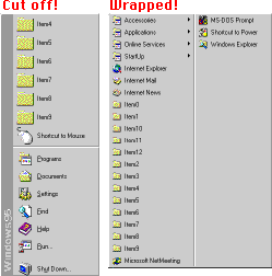
Consistency is the key to good interface
Then there is the issue of how many items you put in the Start Button menu. If you put too many items in the first level of the menu, Win95 just kindly cuts all the other items off. You get 14 items (on a 640x480 screen) and no more -- as compared to about 26 items on the same sized Mac monitor. And on the Mac, when you run out of room, the menu allows scrolling, for even more items. So on the Mac you can not only support more items in the start menu, but you are less likely to have as many things in there cluttering it up.
But remember, nothing on Windows is consistent. If you add items to the next levels of the start menu they won't get cutoff, they will wrap around to display all the items. This wrapping causes visual confusion as to how many layers deep you are, and selection is a little weird since there is "jumping" and so on. The reason these layers of the start menu wrap? Probably because almost all other menus in Windows95 support scrolling, and we wouldn't want the user to be able to predict what was going to happen when they do something. So we keep them guessing by sometimes cutting off menus, sometimes wrap them, and at other times allow scrolling them -- unless they are combo-boxes (which look exactly like menus), then we have a different type of scrolling.
Who's in control?
Apps installed on the Mac go where you put them and not everywhere else. If you want to add something to the Apple Menu, then you have a simple way of doing so (add item to Apple Menu) -- but you have to do it (you are in control).
On Windows everything gets installed into the Start Menu by default (and can add things all over your System). Certainly users want many things in the Start menu, but not everything (the computer is in control). To get things out of the start menu, you have to manually remove them, or many Apps ask where you want to put them (but the default is in Start Menu, and this interface can be really ugly as well -- but is a separate issue).
So the whole differences in UI can be summed up as an issue of who is in control -- you or the computer. I wouldn't mind Windows ("auto-add") behavior so much, if it was easier to move programs around in Win95 (and have things still work), and if it were easier to reorder or manage the Start menu itself (like the Mac and the Apple Menu). But all these problems add up; Start Buttons configurability, the auto-installation of dozens of unneeded shortcuts into the start button, the lack of ability to move Applications around (and have them still work), the cutting off of menu's if you have too many items (in some cases), menu wrapping making the readability very hard, and so on. It just gets to be too much to bear, and it lets the user know exactly who is in control -- the computer (or Microsoft)! While on the Mac it is always the user who is in control.
So most Windows users become overwhelmed, "whipped puppies". They learn to fear their computers, after all, they can't predict when it will "explode" or how it will behave next. So they don't touch anything, or pay experts to configure things (for fear of doing it "wrong" themselves), and they waste time and money on a System that is far more complex than it needs to be. Then these same users pay for every possible upgrade, hoping that it will reduce their pain (when it usually just aggravates it).
Worst of all, many Windows users think Mac users (or other systems) are bigots, because they won't put up with the same abuses that Microsoft is giving them. Every time I point out objectively measurable "bad interface" and inconsistent behaviors, and try to enlighten the world on them, I get labeled a bigot or "everything that is wrong with Mac Advocates". I guess some think the world would be a better place if we all ignored what was wrong, and pretended that it was right. But if knowing bad interface when I see it, and explaining it, makes me a bigot, then I'll wear that label proudly.
|