![]()
Advocacy
Dojo (HowTo)
Reference
Markets
Museum
News
Other
![]()
Myths
Press![]()
General
Hack
Hardware
Interface
Software![]()
Standards
People
Forensics![]()
Web![]()
CodeNames
Easter Eggs
History
Innovation
Sightings![]()
Opinion![]()
Martial Arts
ITIL
Thought![]()

![]()
![]()
![]()
|
There are three aspects of "targeting" menus.
- How far away is the target (distance).
- How easy it is to hit a target (virtual size / constraining).
- How easy it is to remember "where" a target is (consistent placement).
How far you have to travel is related to how easy it is to hit a target. The larger a target is, the easier it is to hit -- the closer the target is, the easier it is to hit. So the trade-off is always how near, as compared to how large.
One of the most important things to remember is how often you are forced to use the mouse to hit the menus at all. If you have rich (and consistent) keyboard commands -- then you won't be forced to target menus as often, and this area will be far less important.
Note that each area is scored only for that areas issue (not all the targeting issues). Add and average the scored together to get a targeting "index" score.
Distance Issues
There are a few issues with distance -- one of the most important is whether the UI uses contextual menus and how well. If the System does use Contextual Menus, then you may not have to move to the menus (as the come to you instead). Not to mention if Applications use palettes, chicklet buttons, and other short-cuts (like Drag and Drop) to alleviate the need to go to the menus. They all factor in to menu issues, and minimize the distance issues.
Mac - Because the Mac uses a "global" menubar (always at the top of the screen), Apple has the most distance to travel (of the compared Systems). This is made worse by larger screens and multiple monitors (in 1984 on a 512x384 resolution screen, this was not an issue at all -- but with dual monitors at 1280x1024, it certainly is). Fortunately, we usually work near the top of the screen (chicklet buttons and other controls are also near there), so it is not quite as bad as it could be -- but the Mac isn't that great either. The Mac can use tear off menus, drag and drop (better than any other System), and can use extensions for popping up the menubar right under the mouse (if this becomes important to the user) - SCORE: 3
NeXT - Also uses a global menu palette (usually at the top-left of the screen) -- but the palette is movable, and all menus can be torn off (and placed closer to the work). There are still issues, because you have to surround your work with the menus for the most "productive" placement -- and then you have multi-window workspace problems. However, for the trade-off of using a second mouse button, the global menu palette can be made to come up under the cursor, negating most of the travel distance required. SCORE: 4.5
Windows / BeOS menus are at the top of every window -- this means that they are slightly more likely to be closer to the work than the Mac or NeXT (unless you have relocated menus with NeXT). But Windows users are often working in "zoomed" mode -- where a Window is zoomed to fill the screen. In this mode it is no better than the Mac. SCORE: 3.5
Other - Some Systems have menus pop-up directly underneath the cursor (by pressing a button on the mouse). This is usually far better when it comes to "distance" traveled, as you are always on top of the menu. The trouble is that many times these menus are "contextual", and other times you are trying to get the "whole" menubar. So sometimes, you have to drag away from your work area (say the text area) -- to get to a neutral space, so that you get to select from ALL menus (not just the text-context menus). So this way is better -- most of the time, but sometimes is more annoying and takes a couple of tries -- where the other Systems have ways to get to their global menu-bars in a very visual and consistent way, and can still use the shortcut of pop-up contextual menus for the power users. SCORE: 4
Target Size
Obviously the larger the target, the easier it is to hit -- but then the more wasteful the screen real-estate. Since we don't want to have huge menus, there has to be a way to make the targets SEEM larger.
I've played with the concept of "gravity" -- where a mouse would "fall in" to menus, and certain targets, so that they would seem bigger or more massive (to the mouse). It would also take more distance (velocity) to escape those objects (they appear bigger to the mouse than they do to the screen) -- but this behavior solves some problems of target size, but may confuse users.
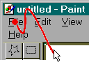
One way to increase the virtual size is to "constrain" the selection (pin them to the edge of a screen, to prevent the mouse from overshooting the menus). Because you can not "overshoot" the top of the screen -- the menu seems "infinitely tall". Because of this "infinite height", on the Mac the menu hits become a one-dimensional hit (instead of two) -- you wrist flick up, then move left and right (with a slight upward direction) and you can never fall off the menus. So for hitting the file menu, you would do like the following image --
To prove how important this is to a Mac user, pick up one of the little "gag" inits (or shareware packages) that cause the mouse to wrap if you overshoot the menu -- or if you have two monitors, place one above the one with the menu bar. You will soon be watching a very aggravated user. Windows users don't know what they are missing, and many have adapted to using more keyboard shortcuts because the menus aren't nearly as easy to use as on the Mac, or they move slower (to avoid overshooting the target).
Windows (and BeOS) is far different -- menus are tied to Windows, and there is no pinning. So if you watch someone try to hit a menu, they usually overshoot, then pull back, and basically zero in on the menu they want in some sort of spiral or zig-zagging in on the target. (Or they are forced to move far slower than they can in the Mac world).
To aggravate the problem further, the menus may wrap onto the next line -- and the Window itself may have a menu (the little control / menu right above the "file" menu") -- so if you are holding the mouse down, searching for a menu item (like people do a lot when learning a program, or using a program that they only use occasionally), then they can "obscure" the menu they want to hit (which is below the current line), or it is much easier to "fall off" the menu bar since it is always a two dimensional move, instead of a one dimensional one (like on the Mac). So the Mac's Menu method gives it a much larger virtual target than Windows Menus.
Mac - The Mac created the Menubar and "pinning" menus -- as such, it's menu pinning is the best so far. You don't overshoot Mac menus <period>, the target seems infinitely tall -- SCORE: 5
NeXT - NeXT was created by Jobs (an Apple person), and the UI people there understood the importance of a global menu system that pining mouse movements to the edge of the screen (constraining) . Next could not copy Apple verbatim (without litigation), so instead of using the top edge of the screen, they used the left edge, and ran the menu as a vertical column. Because menus (English words) are wider than they are tall, it is still harder to hit a particular NeXT's menu (than a Macs) since you have to hit them in the smaller direction (you have to hit them based on their height, rather than their larger width). These "deficiencies" are almost compensated for by the fact that some of the most often used items are put at the "top" level -- while on the Mac and Windows you have to go into the menu to select the item (issue commands). Of course the trade off there was consistency. Another way that NeXT helped eliminate the need to "pin", is by having tear off menus (that can be placed closer to the work, or to use other edges of the screen) -- resulting in less mouse travel. SCORE: 4
Windows has no menu pinning. About the closest they have is that if you click on one menu (and release), then moving back and forth (with the mouse off) will not accidentally select the windows' control menu. Some menus can obstruct other menu items (if the menu bar wraps, and one menu is above the other one -- it will block you from getting to it) -- which causes a special little "go around" move, to get to the menu you want (this is almost the opposite of infinitely tall, since it is un-hittable without doing something else). SCORE: 2
BeOS - BeOS pretty much modeled its Menus after Windows. (Be used to have a global menu that was NEAR an edge of the screen -- but it only worked for some things, and used menus in windows for all others). SCORE: 2
Others - Some Interfaces have no visible menus at all -- the way to activate menus is to select a mouse button and the menu pops-up where ever the mouse is. This makes "pinning" far less necessary (since the target is closer, it doesn't need to be as large). It reduces the amount of travel required to get to the menu AND leaves the edge of the screen available for other things to be "pinned". However, it would lose in ease of use because there is no visual feedback for users, and has to have some "quirky" rules for how the menu pops-up if you are near the edge of a screen -- not to mention some issues with the menu not being able to pop-up underneath the mouse at some times (since the context would be wrong). SCORE: 3
Target Placement / Position
The last issue in hitting a target is whether it is stationary or not (and its position). If the object is stationary (always in the same place) -- then the user can become "programmed" to automatically go to certain places on the screen (with the mouse, or with their eyes) without having to "think" about it. So by it being in a predictable place, the user can develop a "reflex" or what is called "muscle memory" -- because the muscles seem to act without intervention, you just "think" of a menu, and the mouse is already there.
Mac - Because of muscle memory, Apple placed a menu-bar in a predictable place - the TOP of the screen. (This makes sense since westerners tend to read from Top-Left to bottom right -- so the menu, which is the most important interface element, is always at the top of the screen). It is always in the same place -- and most menus are in the same position (and order). Muscle memory is maximized, target placement is static, and users are very happy once trained. SCORE: 5
NeXT - the designers at NeXT did place the menus in a standard place (as default), and there is a "global" menu palette. Because of that, menu targeting is far better than Windows. (You always know where to go to start pulling down menus). However, the menus can all be torn off, and placed anywhere on the screen -- this sacrifices a little predictability for power and versatility. SCORE: 4
Windows menus are never in a predictable place, because they move with the window itself. Zooming the window, will put the menu near the top of the screen (and help) -- but you can not guarantee that your window will always be zoomed, so you can't really build "reflexes". SCORE: 2
BeOS - Be used to have menus split between a "global" menu, and menus bound to windows. This sucked, was confusing, and forced users to go to two places to look for things. Thank goodness they learned quickly and adapted. BeOS now behaves like Windows. SCORE: 2
Others - These vary a lot. Usually they have menus in the Window, like Windows (or more accurately, Microsoft Windows copied them). Some have a pop-up menubar whenever you press a button on the mouse. Some do both. The former is bad for consistent positioning, the latter is better because it makes it irrelevant. SCORE: 3
So for relative usability in targeting, I think
the scoring would come out as follows:
|
|
|
|
|
|
|
|
|
|
|
|
|
|
|
|
|
|
|
|
|
|
|
|
|
|
||||
|
Total |
|
|
|
|
If others (which refers to usually Unix Systems and X-Windows/Motif -- but also includes the Acorn) was a category would get about a 9 or 10. The problem is that it is not one System, it is the way a few different Systems behave. Unix Systems are often not consistent across applications on a single platform -- it is more just a collection of UI widgets that can be used however programmers feel -- with a chaotic and inconsistent result. It is no wonder that many Unix types prefer the command line, when the Apps and environment have so little consistency, and seem to value interface so little.
The scores basically come out right. I tend to feel that the Mac is easier to use (targeting) by just a little, than NeXT -- which is significantly better than Windows or BeOS.
|