![]()
Advocacy
Dojo (HowTo)
Reference
Markets
Museum
News
Other
![]()
Myths
Press![]()
General
Hack
Hardware
Interface
Software![]()
Standards
People
Forensics![]()
Web![]()
CodeNames
Easter Eggs
History
Innovation
Sightings![]()
Opinion![]()
Martial Arts
ITIL
Thought![]()

![]()
![]()
![]()
|
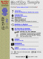 MacKiDo
rev-2
MacKiDo
rev-2
-- up to March 7, 1997
My big foray into frames. It lasted a week or so.
I was able to achieve a look that I wanted, but users could not link to sub pages easily (or they would lose my control strip on the left if they did). Or there is a tehnique where you can manually put the correct URL in the browser, but then if people actually link (bookmark) that page, then they don't get the other frames. This means that you have to include extra controls in the page to so that they can still get around your site. There are lots of intracasies dealing with links and targets -- and many break down people want to link to anything other than a topic page.
Frames made the site faster (in some ways), and was easier for me to maintain the site -- but was harder for users. I have yet to see anything they do for users except confuse them. Plus I had to maintain a non-frame version of the pages as well (which wasn't getting kept up to date), for all the non-Frame browsers -- and there went all those supposed gains and making it "easier for me".
I decided quickly that frames are a bad idea for web-sites, and I have yet to see them done really well. Maybe if HTML/Frames had been designed better, they would be usable, but I don't beleive anyone who has more than a few pages should consider frames. And if you have only a few pages, then there are no site-maintenance reasons to use them either.
I had also given up on keeping everything flat (accessible from one home page). I was just adding way too much stuff. So I broke the home page down into topics (sub-indexes), not just one big long list from the home page
By this time I was deciding on adding in a "MacDojo", where I could teach people things that they couldn't find on other sites. (Rhapsody and User Interface info got stuffed in there). Also other sites started putting up Rhapsody information and some Rhapsody-Only sites, so I decided to only add more information on Rhapsody, if I could add something to the discussions (instead of repeating what was available elsewhere).
I also added in little icons for each section and smoothed the banner. I don't believe in lots of graphics -- it's the content that counts. But icon size picture don't take much time / space, and were fun to do. It also gives the illusion of much more "graphical" interface than there really is.
I had thrown my URL around a bit (and registered with the search engines), and was getting the hit count up. I had gotten almost 5,000 hits. Which was nearly double a week or two before.
![]()
Lessons
- Frame are evil! Avoid them
unless you are a HTML Guru. If you are, then there are
far better ways to solve your problems anyway. (Which
I'll get into)
- Be willing to break long pages
into seperate pages. Don't go too deep, nor too flat.
- Keep focused, and don't try to
do it all. If someone else is doing something better than
you (in one area), then add value and content in other
ways.
- Don't go Graphics crazy --
remember like 'KISS' (Keep It Simple
Stupid) -- well, on the Internet that should be,
"It's the CONTENT, stupid!"
- Register with Search Engines.
All of them -- they can help.
- Keep breaking things into
sub-groupings/topics as things grow.
|