![]()
Advocacy
Dojo (HowTo)
Reference
Markets
Museum
News
Other
![]()
Myths
Press![]()
General
Hack
Hardware
Interface
Software![]()
Standards
People
Forensics![]()
Web![]()
CodeNames
Easter Eggs
History
Innovation
Sightings![]()
Opinion![]()
Martial Arts
ITIL
Thought![]()

![]()
![]()
![]()
|
If you want to look at the way NOT to display information on a screen, look no further than Win95 and its applications. Most Microsoft Applications portray many "no-no's" of UI (User Interface), and Windows is no exception. So by looking at what Microsoft did wrong, and what Apple did right, we can learn a lot about User Interface.
Prioritization
One of the most basic concepts of Screen usage, has to do with how you prioritize the information. What metaphor do you use and why?
Computer technology was created mostly by western culture, and so we put our ethnocentric biases on things.
![]() For
example, our writing systems work from the top-left corner,
and move right across the page, until we get to the end of a
line, and then we wrap to the next line, and travel down to
the bottom right corner. This means that there is a priority
on how we look at a page (or computer screen). Our biases
have effected rest of the world, until they have become
"standard".
For
example, our writing systems work from the top-left corner,
and move right across the page, until we get to the end of a
line, and then we wrap to the next line, and travel down to
the bottom right corner. This means that there is a priority
on how we look at a page (or computer screen). Our biases
have effected rest of the world, until they have become
"standard".
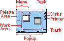
Information on the upper-left of the screen is the most important (what we look at first), and bottom-right is least important (what we look at last). Apple understands this prioritization, and used it to design the Mac interface. Microsoft either didn't know the most basic of UI concepts, or didn't care. Look at the following:
 |
 |
|
|
|
|
The menubars (and menus) are at the top of the screen. This is because they are the most frequently used item on the screen, so they are in a predictable place and in the highest priority position (upper-left). Menus themselves are ordered so that the most frequent items are supposed to be at the top and left, and the least frequent are at the bottom of menus and are the right most. |
The menubars are at the top of every window. This scatters them around the screen. When you zoom an app, it is not so bad since they are near the top. But then there are problems with that window obstructing other windows, and so on. The menus themselves are ordered similar to the Mac. But the point is that there is no prioritization of where menus will be on the screen. |
|
Application (task) switching is a fairly common task, and so is high up on the display priority chain. But it is contained in a control that only displays the information as you need it (through a dropdown menu). This keeps as much screen real estate available as possible. The Mac does need more versatility (power) in the App menu, but that is being added. So the App menu behaviors are better from a real-estate (information hiding) and prioritization point of view. |
Application (task) switching is a fairly common task, so it is at the bottom of the screen (which means low priority). It can be relocated, but the default is bad. It always wastes that the screen real estate (whether you want to see it or not), but you can set it to hide when not in use -- and then when you overshoot the scrollbar (common action) the taskbar pops out (obstructing work),so most users dislike auto-hide. The task bar is usable, but it is poor at information hiding and prioritization. |
|
Windows open in the work area (towards the left, and higher in priority). If the window has a palette (frequently used tools to access the information in the window), it will usually go to the left or above the content window. Palettes can add clutter and confusion, but are usually used (abused) far less than Windows. When you maximize windows they do not fill the screen, they start at the left of the screen, and only take as much width as they need. This leaves screen real-estate for others. |
Windows open over the work area (in front of other things). Most window have lots of palettes (buttonbars) that take up the top part of Windows, and can sometimes be relocated. But the overuse of palettes by Windows can reduce the work area to the size of a postage stamp. When you maximize windows they fill the screen and obstruct all other work. This leaves no screen real-estate for others. So task switching is far more needed (and common). |
|
Disks (and folders and files) are to the right of the screen, so that when you open windows and applications, the content (what is important) fills the left part of the screen, or your work area (which is higher priority). You can do that without obstructing the disks (drives) so that if you want to open anything else, you can just start from the disk (at the right) and find what you want. Disks are less important than their content, and presumably your focus is on the content -- yet the disks are still accessible. |
Disks are embedded an extra layer deeper. So you always have to open "my computer" first, which contains all devices. So there is an extra step before you can work with disks and data. Then when you open them they are often in the center of the screen (they are in a window). This means that any windows or files you open (content) will obstruct these devices. Then you have to hide or close those windows or Apps, or use the task bar to reorder windows, before you can access the file hierarchy again. In other words, there is no prioritization between drives and the data. |
|
Printers are sometimes used to drop data (files) on to print. Or opened if you want to see the status of a print job. So both are accessible by placing them right below the drives in priority. |
Printers are embedded a couple layers deep (inside "my computer/printers/"). This makes accessing them (and their information) harder. So most people only work with printing through applications. |
|
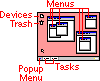
Control Strip frequently used setting are accessible through a little pop-out control called a control strip. |
Some apps patch Windows to have access to settings via the taskbar. But this method, and their behaviors are not standardized. |
|
Popup items frequently used folders (and their items) can be docked at the bottom of the screen. This allows users to shortcut the drive hierarchy and get to their work quicker. |
The bottom of Windows is used to switch applications (like the tasks), and you can't have as quick of access to frequently used items (other than shortcuts, which work like Mac aliases, only worse). |
|
Apple has their Apple Menu which does everything the start menu does in windows. Except the Apple menu works better, since the hierarchy isn't as deep (faster to work), and it is easier to configure and manage. It also has more features like recent items. |
Start menu is at the bottom of the screen. This is where you get to things that are kept in menus in any other program, except the file explorer. Don't ask me why there is this inconsistency. I especially like the logic of putting shutdown as the first item in the start menu. |
|
Trash is placed in the bottom-right, lowest priority (since you don't want to accidentally destroy data). It is away from everything else. |
Trash is placed next to drives and in a high priority position. Also there is a little trash can inside of the file explorer. This makes data removal easier -- but so easy that you can accidentally destroy data. |
Windows is highly configurable, which is not always a good thing in UI (despite what many geeks think). So many "bad" Windows behaviors are "fixable", or there are workarounds, with proper configuration. But most people don't make those changes (because they don't know how), even when the changes are as easy as making shortcuts to the desktop (to make it behave more like a Mac). Besides, the point of this article is default behaviors.Some features have other advantages, and disadvantages, not mentioned here -- but this article's scope is screen utilization, not the merits of every feature mentioned.
Other screen utilization issues
There are plenty of other User Interface gripes (dealing with screen real-estate) that I have with Microsoft. These are more than just opinion, these are lack of understanding, or poor usage, of basic UI concepts.
Chicklet Buttons
Microsoft took Apples idea from MacWrite (embedding a ruler in a document) and MacPaint (tools/palettes), and went berserk. They created 'chicklet' buttons galore, so that all the functions that you can easily find and understand in the menus, are now embedding in a visual cacophony of confusing little buttons -- all wasting precious screen real-estate. This confuses users, and increases their chances of errors. User; "Oh no, that was the self-destruct chicklet!"
Don't get me wrong, some chicklets and palettes are not bad, but not everything should be accessible through one. An example of 'a little is good, a lot is bad'. Read the following list:
- Buttons are proper when there are a few often used buttons, buttons are wrong if they try to everything.
- Buttons are fine if they do functions that are visually obvious. They are wrong if they do things that the user might not see the results of, so they click again and again and wonder if they clicked at all.
- Buttons are wrong for destructive behavior (since accidental clicks are not uncommon).
- Buttons are wrong for file commands or if they pull up dialogs and require more input (since that slows down the workflow).
- Buttons are wrong if they are only used for menus (since that is what a menu or menu bar is for).
I just wish Microsoft would read this list, and apply it. Either they know these UI concepts, and don't care because they sell the glitz and not the usability (and don't care about productivity or usability), or they are incompetent and have ripped others off poorly. I suspect the former.
Orientation
Most monitors are in a landscape orientation (wider than they are tall). Most of the information you want to display is pages of information (which are taller than they are wide). This makes vertical screen real-estate far more important than horizontal real-estate. This is why Apple created vertical palettes that you go to the left of a document window, and the Mac supports floating palettes that can be moved anywhere (or closed).
Application developers didn't understand why apple did this, and some applications reflect their ignorance (Microsoft's Apps are the worst culprits). The results of this ignorance are apparent in Win95 and are forced on many of its Apps; both by MDI (parent-child Windows, and by following their standards). Look at these two images:
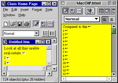
In some ways this image isn't fair:
- Claris Home Page doesn't really have a status line, but most Windows Apps do (so added it to this app to stress my point).
- Many people will maximize the parent and child windows (to minimize the poor real-estate usage) -- but in order to maximize those separately it takes an extra step (or two) setting things up. When you are working with more than one file at a time it is almost always going to be in the wrong state (at least part of the time). And it forces a more "modal" work flow, since a zoomed document obstructs all other documents.
In some ways this image was not harsh enough:
- Most Windows apps have more than one status line.
- I was viewing Windows with compressed settings. You can sent font sizes and other UI elements to be larger.
- I didn't include the Windows taskbar in my image (which takes more vertical real-estate).
- Claris Home Page doesn't use as many palette lines as most Windows Applications, and CHP has more palettes than are normal for the Mac.
Notice the difference in usable screen real-estate?
Normally, on the Mac you have a scroll bar, a Menubar, a window title, and maybe a palette (but usually a vertical one that isn't taking vertical real-estate). So 3 or 4 vertical lines are used.
On Windows there is normally a titlebar (or two), a menu bar (or two), a palette bar (or 4), a status bar (or two lines worth), a scrollbar (or two), and the taskbar. Then there are little space-separators every so often (little borders around things to give it a more 3D effect). So up to 10-15 vertical lines can be use (for a large percentage or your usable vertical real-estate).
The Mac is like having a bigger monitor (in this example a monitor 3 times as large). The Macs superior real-estate efficiency is like money in the bank (by having a larger monitor for free, or being more productive on a smaller one).
Multiple Monitors
As if the advantages of the Macs use of screen real-estate weren't enough. The Mac also supports multiple monitors, which many graphic artists, video producers, programmers, businesses and even schools take advantage of. Quite often I've recommended that users and clients buy two 17" monitors instead of one 19"; they end up with more screen real-estate, they have a built-in back up (in case one monitor breaks), and it can cost less.
Windows95 does not support more than one monitor, though there are rumors than Win98 may support it... finally. But with Microsoft you have to wait and see. Windows98 is mostly fixing bugs and delivering on features promised for Win95 (which was originally called Win4/Chicago and scheduled for '92 - '93). And then there is the question of how well it will support it. Win95 is supposed to be plug&play, but the results were less than stellar for the first few years. WinNT sort of supports multiple monitors -- but it it is hard to set up, and it can't do the most basic of things (like not put your dialogs in the middle of two screens, or support different color depths for each monitor, and so on). So while Microsoft may get multiple monitor support working before 2000, the Mac has done so (the right way) since 1987. This time Microsoft is more than their usual 10 years behind Apple (1).
(1) Remember, Microsoft took until Win95 to "catch up" with things like long file names, desktop metaphor, and so on -- which was available on a 1984 Mac, or 1983 Lisa. Of course "catch up" is generous, since Win95's implementations have many holes and flaws than the Macs of a decade earlier.
Conclusion
Apple understands the value of screen real-estate and about prioritization. Microsoft does not, or does not care. So while most Mac users have a hard time quantifying why they like the Mac so much, they do know it is better. Hopefully this article (and all articles in the Interface section) will give them more ammo for exactly why the Mac is so much better -- from User Interface perspective.
Many people claim that Microsoft did their Interface different (wrong) just to be different, and to avoid losing the lawsuit over look and feel. But that assumes that Microsoft knew what was right, and consciously made a decision to make a worse interface. I'm not convinced they had the expertise to make an educated decision -- or that they cared. If they cared they could have hired the expertise (or would have listened to them). So they may have done it different, just to be different -- but I doubt they understood enough about UI to know how bad it is. I think they just want to "ship" and "win," and don't care about their customers or the usability, beyond moving boxes and making a buck.
|