![]()
Advocacy
Dojo (HowTo)
Reference
Markets
Museum
News
Other
![]()
Myths
Press![]()
General
Hack
Hardware
Interface
Software![]()
Standards
People
Forensics![]()
Web![]()
CodeNames
Easter Eggs
History
Innovation
Sightings![]()
Opinion![]()
Martial Arts
ITIL
Thought![]()

![]()
![]()
![]()
|
In User Interface there are personal preferences, but there are rules (guidelines) about what is right or wrong. Apple and Xerox basically modeled most of their controls after things that we are familiar with in the real world. Buttons, Radio-Buttons, Checkboxes, Sliders are all things that people have seen before. That means that there is a metaphor (theme or real world example) to help people intuitively guess what the control will do just by looking at it, or by playing with it. Menus were something that people had become familiar with on computers before GUI's, and are very easy to explain, so they were good interface as well. Later, others (like NeXT, or some Unix folks) added controls (like tabs), they modeled them after things in the real world (like little tabs on folders, file drawers or in notebooks). Again, that interface was clear and intuitive.
Microsoft has contributed one control to the interface world -- the Combo-Box. And like almost all things Microsoft, it is a bad implementation of user interface. Many people can use them, but only because of their adaptability to the computer, certainly not because the behavior is obvious, clear or simple.
How it works
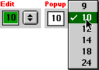
A Combo-Box either works like an edit text field, a popup menu, or a scrolling list, depending on mood (parameters set by programmer), and the way the user tries to use the control.
A part of the Combo-Box always behaves similar to a menu:
The Combo may or may not have anything in it (nothing). If you start by choosing the arrow, then it will drop down a menu. You can pick a menu item (like 14 point font), and release. But be careful, in its released state it will still have the value selected and if you bump a key it will add to the value, or replace it, with the text you type (sometimes). Only when you select another control will this controls value secured. While this behavior is similar to an edit text, it is an unusual behavior for a menu.
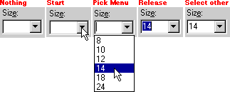
Sometimes a Combo-Box behaves as an edit text control:
The Combo may or may not have anything in it (nothing). If you start by selecting inside the edit area, then it will SOMETIMES behave like an edit text. You may be able to enter a value (like 24 point font) by typing it in. Just because you think you are done, does not mean that you really are -- if you bump the keyboard it will continue adding to that value (text) or replace the whole string you typed. Only when you select other (anything else), and the little vertical edit text bar goes away, is your value safely entered.
Sometimes a Combo-Box does NOT behave as an edit text control:
Sometimes, when you select the edit text area, you get a drop down menu. Imagine your surprise when you are expecting it to behave like it did before (as an edit text), and instead you get a dropdown menu. And here is no way to tell which behavior you will get until you try it and just see what happens.
If you release and select nothing, you get this blank highlighted value. Be careful, it is still in an edit mode until you select a different control. If you bump a key it will SOMETIMES fill the value area with the first match it can find in it's invisible list (the first item that starts with that numbers or letters that you pressed), other times it will not. I think there is a flag to say whether it is behaving like a menu or a list, but there are no visual queues.
|
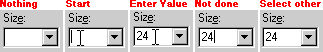
If a Combo-Box has many items, then it may (or may not) have a scrollbar to scroll through the list of items. If you hold the mouse button down, and move below the last item in the list (or above the first item), the control will "auto scroll" (keep scrolling in that direction). But if you select the Combo-Box, and release the mouse (the control still stays "open / out"), then the auto scroll will not work and you must use the arrows and scrollbar to find the item you want.
Selection
The Combo-Box does behave like a list in that if you type characters (quickly), the control will automatically match (and select) the first item in the list with those characters. So you can select an item from the list, just like any other list -- SOMETIMES! But it can't always do that, since sometimes it is behaving like an edit text. In those cases, when you type characters, the Combo-Box instead just places your new text over the selection. In those cases, when you are done, the Combo-Box will add your "new" item to the list (usually). But there seems to be a separate flag on whether you can add to the list or not.
Activation
One way to activate controls is to tab through each one (using the keyboard). If you reach the Combo-Box by using tab, it will activate (look like select nothing) -- but it does not drop down your choices, you must use the secret key sequence of ALT-DOWN ARROW to get the menu/list to pop out. If you have activated it (without the secret key sequence), then none of your choices are visible, yet it will still try to match any characters you type with an item in its list -- IF -- it is behaving like a list/menu.
If the Combo-Box is behaving like an edit text, then text will just add your new item to the invisible list (when you click somewhere else). This is nasty, since you may have added a duplicate item (except for some minor change in spelling, punctuation or capitalization) -- and removal of these duplicate item can be tricky, or impossible.
Once again, after you've selected the choice you want (or entered the text), you must "tab" on to the next control, or select some other control; otherwise if you bump a key, the list will change selections or it will add or replace the value you just entered. And always remember to NOT hit return, because that may just dismiss the dialog.
Are there better ways?
Some people think that because the control does some complex behaviors, that it is good. After all, it solves a problem. Well solving a problem, and solving it well, are not always the same thing. Lets solve these problems using discrete controls and see if it is more clear, or if it is less clear.
Remember, we already have a Menu, and Edit Text, and a List Box controls. They all do their respective functions clearer and better than a Combo-Box. So the Combo-Box only has value if it can do something that they can't.
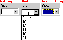
In fact, a menu does some things better; like scrolling through long lists of items. A menu can temporarily take up the entire screen, and just add arrows to scroll through the list, as follows:

So the menu is better at displaying information (it shows more than what a list can, since it can take over the whole screen, not just part of a dialog or window). In other words, a menu is better at using screen real-estate than a Combo-Box, and better at information hiding.
But of course only Mac menus can scroll, Windows menus do not (by default). Applications that do allow menu scrolling in MS-Windows all had to add that behavior themselves. That is why the "Start" Menu in Windows does not scroll -- they didn't add it. Instead it just does this weird wrapping thing (if you have too many items in a menu), and this wrapping is confusing and ugly. Because everyone has to add this menu scrolling behavior themselves, it is "nonstandard" by definition -- and many won't use it, or implement it "uniquely".
Of course a list is a better list than a Combo-Box, after all, it is always visible and the behavior is more obvious. And of course, an edit text is better than a Combo-Box for editing text, since the behavior is obvious (and you never have to worry about this weird typeahead behavior or menu/list popping out, or limiting your choices).
So, since the discrete controls are better for each of their functions, the only place the Combo-Box could possibly add value is in a few weird "combination" functions that we may need to do. So let's look at each of those combo-functions, and see if we can't do them better without the use of a Combo-Box.
Edit-Text & Menu
We can use an edit-text and a menu right next to each other (or above and below each other) without needing a Combo-Box. So the Combo-Box is unneeded, and in fact things are probably far clearer as two discrete controls. So no value is added by the Combo-Box for that function. If you doubt this, look at the following:
We can enter values with the edit text, or we can choose from defaults from our menu. (Optionally have new edit items added to the menu list). Everything the Combo-Box does, but clearer.
In fact, we can do it another way as well:
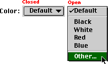
Here we could have a popup menu that would have an "Other..." (or add...), which would present a dialog to enter items from. This dialog could present far more information about the context of the items, and can have far better ways to pick those items. In this case, the Mac would pull up a color picker -- which is far easier to enter colors from than scrolling through a list (like the combo-box does).
So once again, the Combo-Box has added no value to the interface, and has in fact detracted from it, and from using better (clearer) solution.
Edit-Text & List
Combining Edit-Text and a list is sometimes done -- but there are certainly a few ways to do it. A basic way is how the Finder Preferences do it for Labels:
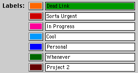
You can edit each item in the list, and this is far faster because everything is displayed and active. If you needed more items in the same space, the programmer could have the whole list scroll (with scroll bars around that region). But if you are doing that, then what problem are you really solving? Look at the following:
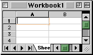
Look familiar? It should, it is Excel. It could easily be ClarisWorks or some other spreadsheet or scrolling editable list. Which is what a spreadsheet is: nothing but a huge two or three dimensional list of edit texts. Ironic that Microsoft couldn't figure out that this was a better way to enter information into a list than some weird control.
Of course I have also seen the problem solved with a list box, a single edit text, and an "add" button. Or there are dozens of other ways as well. The point being that the Combo-Box has once again added no value, and just made the interface complex and confusing.
Conclusion
Why is the Combo-Box evil (bad User Interface)? Adding information, and picking from a list of information, are two discrete actions -- like stopping and starting a car, or turning and braking. We don't drive our cars with a joystick for this exact reason. Gas,, brake and steering are separate because they should be, and people understand separate controls better. It is this "combining" of functionality that makes the Combo-Box less than clear, and less than good interface. If you have to name a control something like "Combo-Box" then it is already ambiguous. And it only gets worse; Anything that can't be explained in a simple sentence, without a lot of "unless", "except", or "also's" is bad interface. A user should know all possible behaviors of a control before they use it, just by looking at it, so that they won't get confused by some unexplained action (behavior). If you have to read a two pages of explanation on how a control works (sometimes), in order to understand those behaviors, then it is not good UI. Most people don't even understand all the behaviors of a Combo-Box, they just play with it each time to see how it is going to work (for now), or until they get the results they want.
The fact that people can use, and tolerate, a Combo-Box, is reflective of Man's adaptability; it is not reflective of clear interface. For clarity you never want to blur functionality, even if you think it would be cool. Interface is striving for clear, obvious and easy -- never hidden, secret, or enigmatic. Controls are not conundrums! Microsoft allowed their programmers to design a "cool" control for themselves, and those programmers figured, "Hey, wouldn't it be neat if...". But the question a UI person is supposed to ask is, "Is it clearly understandable if...". The Combo-Box fails that most basic UI question. More than that, it clearly reflects everything Microsoft -- a bad and glitzy interface, that poorly stole its design from many other better controls. Instead of clarity and consistency, the Combo-Box offers reduced productivity, visual and behavioral confusion and something that the world would be a better place without -- but Microsoft figures, "what the heck", they can sell it and some deluded techno-weenies think is "neat". Features over functionality is their motto.
Once again, Microsoft proves that either they don't have a clue about User Interface, or that they don't care about productivity, their users, or being clear. If you ever figure out what a Combo-Box is good for, besides ridicule, please be sure to let me know.
This article is dedicated to a few people (and especially one friend, Dan), who would ask me, "What's so bad about a Combo-Box. Just because we geeks can understand it, doesn't mean it is good interface.
Created: 04/23/98
Updated: 11/09/02![]()
![]()
Top of Section
![]()
Home
![]()
![]()