![]()
Advocacy
Dojo (HowTo)
Reference
Markets
Museum
News
Other
![]()
Myths
Press![]()
General
Hack
Hardware
Interface
Software![]()
Standards
People
Forensics![]()
Web![]()
CodeNames
Easter Eggs
History
Innovation
Sightings![]()
Opinion![]()
Martial Arts
ITIL
Thought![]()

![]()
![]()
![]()
|
Don't count on it
The first thing to learn about color is that not all people see it -- in fact many don't (there are millions of people who are colorblind to some degree). To make matters worse, monitors and televisions are really bad at "repeatability" (keeping colors the same across displays). So red on one screen may be orange or ruddy on another screen.
NTSC is the video (television) standard used by all north American televisions. Some jokingly imply that NTSC stands for "Never-the-Same-Color".
So you can only use color to add MORE information, but don't use it as the only way to convey information. If something displays necessary information using color, there should be another backup method for conveying this same information (like by using texture or contrast).
Too bad Microsoft never learned this most basic of lessons.
Compare the following:
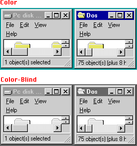
Notice that if you are a Windows user, and you are color blind, it is very hard to differentiate which window is the "active" window. Much more so when you have many windows open. The only difference between active and inactive is that the active window uses color (blue). When you don't see color, there is very little difference in contrast. And this is one of the best color schemes (the default). Many others are worse.
Now look at the Mac:
Notice that if you are a Mac user, and you are color blind, it is very easy to differentiate which window is the "active" window. Apple uses window texture, contrast, and the state of the controls to also differentiate active from deactive windows. Color accents things, or highlights things (like drawing the users attention to the active controls) -- but color is not the only way that information is conveyed to the user.
Apple has been supportive of accessibility (disability) options. With tools to make the screen larger (CloseView) or to read text (Macintalk) for those with vision troubles. Or with tools to help people with one hand (EasyAccess). Microsoft mimicked Apple, usually about 10 years later.
Not just for Colorblind:
But the point of what is more important, color or contrast, goes way beyond applying just to the colorblind. All of our eyes see contrast better than color. Look at the following:
Which is "clearer"? It should be immediately obvious that contrast and detail are far more important than color (for readability). So all the points about color and contrast (and Apple's better use of them) go to overall clarity and usability of interface.
Only the beginning
Of course Color/contrast/texture usage with the Active/Deactive Window states is only one example of doing things right. There are many examples of proper and improper use of color.
Apple attempts to use color to portray MORE information. High contrast black text on a white background is important for clarity and readability, and for representing what the page will look like. Before users got familiar with this (largely through Macintosh), PC screens seemed to represent text in every color EXCEPT how it would look on the final page -- though after 10 years, Microsoft has almost caught on.
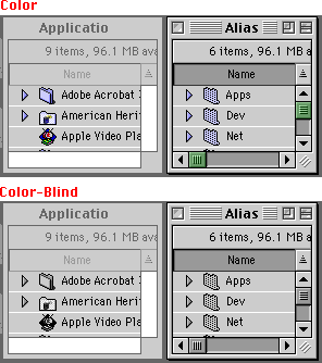
On Windows color is for fun (or torture), not for function. When Apple added color they decided it would have a purpose. In the Mac finder, users can tint (colorize towards a color) icons to label categories that an icon can belong to. So I can select an icon, and "label" it with a category (color), and then search by label (color) or sort by label (color). Notice in the example the window is sorted by label (color), which is why the column is not alphabetical.
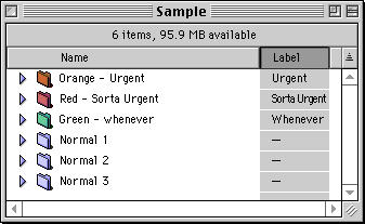
Remember, color should not be the only way to see information, it should enhance it. Notice the "Label" column? It represents the labels (colors) as well, it just does so with a textual representation (so that if you are on a black & white or grayscale monitor, or you are color blind, you can still use them). Also note that the label column is darker than the name column (HTML washed the colors out so it is not as clear), to show that users that the column is sorted by label. This is another example of color (shade) being used to convey information, and as always the selected column (label column and column header) also looks a little different, so that color is not the only way this information is conveyed.
Cursor
Another example of color (contrast) choice, can be seen in the following:

Most pages are white, with black text. So when Apple created their cursor, they made it high contrast black (high contrast compared to the white page). Then Apple put a white border around it, so that you would still be able to see it on a black background. When Microsoft stole Apple's cursor (bit for bit) the only change they made was to invert it. As usual, where they diverged from Apple is how they made the interface worse. The white cursor on a white page (the normal display) is far harder to see, and a worse use of color (contrast). They've only had 16 years to fix this mistake -- I wonder how much longer until they "get it".
Other uses for color
You can use color for selections. You can add color to pages. You can use color to emphasize or attract attention. You can even use colors in icons for appeal. But it is important that the color always have a purpose (and add value).
Microsoft felt that the user, or app writer, should have any ability with color they wanted. They could make red text on a blue background (so colorblind people can't use the computer). There was no need for taste or style. Color is about adding a gratuitous feature, giving people useless configurability, and for making people THINK they are getting something -- not about actually giving them something of value. In fact giving some people configurability without constraints or guidelines can actually be counterproductive, since they all have to learn the same mistakes -- it is like having roads without lines or rules. Accordingly, Windows gives you the ability to do whatever you want with color, and would certainly not presume to help make the computer easier to use, nor make it display information better.
Just because you can wear stripes and plaids together, does not mean that you should. Windows is like letting your geeky, unfashionable, colorblind (or completely blind) friend dress you every morning.
More?
Another example of "how not to" can be seen in dialogs and their controls. On Mac dialogs and controls all use high-contrast shades with accent colors. Win95 decided on using low contrasting gray on gray: which they stole from NeXT (1), poorly. The results are that Windows is often confusing, low-contrasting, and harder to read. Not to mention that the 3D effect used often wastes more screen real estate than the Macs 3D effects do. Though Windows has gotten better over the years, and monitors have gotten better as well (which hides the symptoms).
(1) NeXT made this sleek designed Hardware and OS to feel modern, and gray on gray added to that "feel". However NeXT used a 16 shade grayscale monitor. Grayscale monitors are more clear than color ones, so this guaranteed clarity and readability. Unlike what happened when Microsoft tried the same thing, using someone's home computer with a poorly adjusted, inexpensive, color screen.
Color Matching
Then Apple did not like that color was inconsistent across devices (and wasn't accurately representing the image) -- so they fixed it. Apple pioneered Color-matching on personal computers, so what you saw on the Monitor looked like what other people saw on their monitors -- and on their printers, and scanners, and so on. ColorSync just works. After 10 years of waiting for Microsoft to fix it on their side, Apple has given up, and is even adding ColorSync to the Windows world, so they don't have to keep suffering.
Conclusion
There are still other issues with color, but you should have a basic understanding of the Do's and Don't about color -- with the Mac usually showing the "Do's" and Windows usually exemplifying the "Do not's".
Being free to set whatever colors you want, do whatever they want with color, with no guidelines, no standards (as in no standardized selection color) and so on, is a bad idea (from an interface perspective). Leaving this free to Apps (and developers) to implement colors how they want, without guidelines, is also a bad idea. Color is not just for decoration or reducing the usability of the interface -- it CAN enhance it, if used properly.
On the Mac, color has purpose, direction and standards. The colors will match from machine to machine, and it will even match the real world. When you pick a selection color it will be used across all Applications (unlike the Windows world). The interface will use color the same way across Applications (unlike the Windows world). And color adds information and value to the usability of the interface (also unlike the Windows world). So when it comes to understanding Color and using it properly (for interface). Now you, I, and Apple, all "get it". Microsoft still does not.
|