![]()
Advocacy
Dojo (HowTo)
Reference
Markets
Museum
News
Other
![]()
Myths
Press![]()
General
Hack
Hardware
Interface
Software![]()
Standards
People
Forensics![]()
Web![]()
CodeNames
Easter Eggs
History
Innovation
Sightings![]()
Opinion![]()
Martial Arts
ITIL
Thought![]()

![]()
![]()
![]()
|
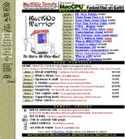
MacKiDo rev-5
-- Up till July 4, 1997
Things obviously stabilized, as the site didn't go through a change for 3 months. (In others words, MacKiDo 4 lasted as long as the previous 3 versions combined). I achieved a user experience that I was pretty happy with, so I stuck to article additions.
The yellow was too bright on the home page. I also decided to re-lay-out the tables since text flows unusually in some tables (especially in some browsers). So I chose tables that looked better in more cases -- by simplifying them (making them into lists, instead of complex two dimensional tables).
I decided to seek a sponsor, and I sent a letter to MacCPU. They were interested and we struck a deal. They helped pay the costs to keep my site up, to offer it as a public service. I basically ran out and spent the money I had saved myself on a pen tablet, and used the tablet to create the little "MacKiDo Warrior" guy. Hmmm -- not my best planning.
I fought and fought with CLUT's (Color Lookup Tables) for my background pattern/picture -- which had a nice "texture". But the colors changed from platform to platform, and browser to browser. (And I was trying to use the magic 216 colors which are in common). It looked nice on a Mac, but was unreadable on some PC's and Unix platforms (especially in 16 color mode) and Netscape 4 looked different than Netscape 3, and so on. So I gave up. I just made the background of the text portion of the site "white" instead of a soft patterned light gray. In general, if you are offering a site to be multi-platform, then you probably shouldn't bother with a texture behind the text -- stick with basic colors. It is more readable.
I created the "Game Reviews Index", because I thought that was something cool for users. Unfortunately it was way time consuming -- I wanted to create more of them, but I just don't have time. (So I looked for helpers).
Everything is working nicely, and I had systems all worked out for doing things. That's why this format stuck -- it has survived trial by fire. 300+ pages, and adding more all the time, and everything just seemed to fit.
My hit count was 90,000 by fourth of July, far more than I had expected, and I was thrilled. I learned that by submitting article to News-Sites, that I could increase my hit-count and exposure. There is a lack of good content on the internet, and by providing it, News Sites were happy to help me out. This was the key -- finding other sites to help me (and vise versa).
![]()
Lessons
- The internet is starving for
content. If you can offer good content, and tell the
right people, then you will get attention. In my case I
wrote articles, and then informed all the Mac news-sites
in a little mini-Press-Release of my own. They would hook
up links, and that got me readers. MacSurfer was one of
the greatest aids to my site -- but all the others sites
helped.
- Keep thinking of new services
you can offer. (Like me and the Game Review Index). If
you keep adding value to your site for users, then they
will keep coming back. They are what is important. But
don't be afraid to abandon things, or ask for help, on
things that you just don't have the time to do yourself.
I could do the Games Review Index, and I enjoy it. But if
I did that, I wouldn't be able to write and offer the
other services.
- When you get something that
works, don't change it. Evolution is better than
revolution to users. When you do change your site, do it
gradually and in small steps. Users won't notice the
changes as much, and will have confidence that coming
back to your site will be a pleasant experience (instead
of a scary one).
- Avoid background patterns
behind texts (especially small text). Solid colors are
readable (but choose them carefully as well). But
patterns only work right for some platforms.
- Remember to try your site on
multiple platforms and browsers! Things change.
|