![]()
Advocacy
Dojo (HowTo)
Reference
Markets
Museum
News
Other
![]()
Myths
Press![]()
General
Hack
Hardware
Interface
Software![]()
Standards
People
Forensics![]()
Web![]()
CodeNames
Easter Eggs
History
Innovation
Sightings![]()
Opinion![]()
Martial Arts
ITIL
Thought![]()

![]()
![]()
![]()
|
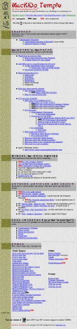 MacKiDo
rev-1
MacKiDo
rev-1
-- up to February 27, 1997
Decided on a softer green in the spacer area.
I want to visually break up a page and have some white space (non-text areas) -- this makes things easier to read. Because this space is unused, it often evolves into a "control" area. But I didn't do this yet.
Still keeping the site as "flat" as possible -- the first page was just a huge index. I didn't want to force users to have to tunnel in to get somewhere. Still focusing mostly on MacMyths -- which was the original purpose of the site. But I started to diverge a little more.
The basic sections were
- Rhapsody
- MacMyths and Mac Facts
- Wintel (the Evil Empire)
- Authors, Articles and Idiocy
- User Interface
- Humor
- Some links and other stuff
I was filling in areas, and regrouping them slightly. I pulled lots of humor out of files I had been saving. Decided that I was adding enough stuff, that it was hard to figure out what was new -- so made a "new" graphic, as well as one for pages of external links.
I used a neat tag for doing a background picture in a table. It made a really neat shadow effect in my Section-Titles. Turned out it only worked on Internet Explorer, which made things in Navigator look worse.
I also created a color theme for the site. Choose a few colors (that look good together), then reuse them. Different colors should have different meanings -- and don't break your own rules. 3 or 4 is good enough for most beginners, maybe a few more if you really understand graphic arts. (I sort of had one before -- but I refined it, and made sure to stick with it. I refine it over time, but I make sure I am sticking with one on every version of the site).
I had gotten almost 2,000 hits. Since my original goal was 10,000 by the end of the year, 2,000 in one month was pretty good.
![]()
Lessons
- Add your URL to your signature
(it increases exposure)
- Keep white space (non-text
areas) -- like margins in books. The eye's need
breaks.
- Avoid proprietary tags!
- Create a color-theme and stick
with it
- Start breaking things into
groupings/topics early.
|