![]()
Advocacy
Dojo (HowTo)
Reference
Markets
Museum
News
Other
![]()
Myths
Press![]()
General
Hack
Hardware
Interface
Software![]()
Standards
People
Forensics![]()
Web![]()
CodeNames
Easter Eggs
History
Innovation
Sightings![]()
Opinion![]()
Martial Arts
ITIL
Thought![]()

![]()
![]()
![]()
|
A menu is a way to give the user the ability to choose among multiple commands. These commands are usually grouped into menu topics (individual Menus), which are a list of menu items. The user selects a "command" (menu item) from the list, and an action is performed. Such a simple concept. But there are a lot of details and variants.
Parts of a Menu
Here are the parts of a menu (as seen through a Mac users eyes -- though the concepts are valid for other UI's as well).
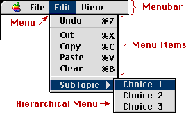
- The menubar is not where Menus go to get drunk -- but
it a place where Menus go to meet other Menus (it's a
grouping of individual Menus, all in one place). It is
not necessary for every Menu to be in a (the) menubar --
but it is common if you have more than one menu.
- The Menu itself is just a list of Menu Items to
choose from.
- The Menu Items are actual commands (verbs) that will
do something.
Menus usually follow a sequence, like as follows:
|
| You start with a menubar (of some sort) Then select a topic (menu) and a menu of choices is available. Sometimes you go down to a sub-topic, and another menu pops-out (and you select the sub-topic). This last step (Sub topics) are called hierarchical Menus, and are an option. |
Sometimes menu items may have "sub" Menus". This is done for more logical grouping of menu items (as are divider lines), and to prevent Menus from getting too long / tall to be displayed well. Hierarchical menus are usually denoted with an arrow (showing that more information will come out).
It is generally not recommended to have more than one level of hierarchy (because it becomes too hard to find things, and becomes painful for the user to navigate all those levels).
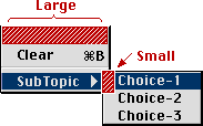
Good or Bad? Hierarchical Menus are are a hot topic among UI people. Selecting a menu item is easy. You only have to be accurate in one direction (vertically) -- and you can be sloppy in the horizontal direction, without "falling off" the menu. [See the "large" area on the diagram].But when the user selects (or moves over) a sub-topic, users have to change from moving vertically, to going out horizontally through a relatively small channel [see "small" area on diagram].
This change in direction, and being forced to thread the cursor through a small target, makes using hierarchical Menus DECREASE productivity, even while it maximizes menu (screen) real-estate, and can improve logical grouping. As a result, hierarchical Menus should only be used for seldom used functions. Apple also recommends only using one level of hierarchy.
Another important concept of Hierarchical Menus is hysteresis. [Read Article on Hysteresis] to understand what it is, and how it works.
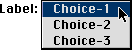
Pop-Up Menus
These are Menus that "pop-up" from a special control. There is usually no menu-bar associated with pop-up Menus, they are usually stand alone Menus. The user can select the control, and the menu pop's-up (or usually down).
The irony (confusion) is that pop-up Menus are usually not used to do actions or commands (like the menu-bar Menus), and instead are usually just a way to make an exclusive selection.
There are other controls that can do this function (as well), but the pop-up has most of the information is hidden from the user (except the relevant selection) unless they need to see it (sometimes called progressive disclosure). Other controls (like radio buttons) display all of the information, all of the time (taking up precious screen real-estate).
Sometimes pop-up Menus are labeled, other times they are not. The Mac is good about giving visual feedback (like the little down arrow), to indicate what is going to happen. Some other systems (like Windows) give you fewer hints (which is bad UI).
Just for the record, no sane person should use hierarchal pop-up Menus. Also allowing pop-up Menus to have multiple selections is a really bad idea as well. Issuing commands from pop-up's (like pulling up dialog boxes, or doing something other than changing a state) is "no-no" as well.
Hidden Menus
Some Menus are just there, but you have no indicators or reminders that they exist. This is generally a bad idea (in interface) because without being told, a user might never figure this out.
Some User Interfaces (Sun's Solaris, X-Windows, etc.) don't have a menu-bar. Instead they opt for a button on the mouse to always pop-out a hidden menu (or Menus). In user interface the general rule is to "avoid surprises" (and hidden actions) -- and it is certainly surprising to users who don't know about it to have Menus that just appear -- in other words, it's bad interface. But users adapt quickly, so it isn't THAT bad, once the behavior has been learned.
It is also less "bad" [to use hidden Menus], if the functions done from them are not required or common functions -- in other words, if they are just extra's or short-cuts for "power users". Then it becomes a form of progressive disclosure -- expert users learn how to do more, but new users are not burdened with a lot of choices that they don't understand.
Contextual Menus
These are a type of hidden menu. These Menus usually require a special button or action to activate.
In Windows, sometimes the right mouse button will activate a contextual menu. On the Mac (OS 8) pressing control and the mouse button will activate a contextual Menus in the finder (and in some apps, like Netscape, just holding the mouse button down without moving the mouse will pop one out).
Not only do Contextual Menus "pop-out" a hidden menu, but the options given will change depending on what was selected (what the pointer was over) at the time. So if you are over a file, you are given file options. If you were over a folder, then you get folder options. And if you were over text in a document, you are given document-text options. The choices vary by context -- hence the name.
Tear-Off Menus
This is where a user can drag a menu right off the menubar, and place the menu anywhere on the screen (it basically behaves like a little window, with menu choices on it). They were starting to become popular in the late 80's, but palette's and chicklet buttons (those little buttons embedded in application windows) reduced the need for tear-off Menus.
The disadvantage is that tear-offs are often space inefficient -- but they were easy to explain to users, and you can place them close to your work.
Conclusion
That should be a pretty good summary of the basic types of Menus, and how they work. I hope to add to this a little over time (and do some more graphics). If you have any questions, send me email, and I'll see if I can answer them (for everyone).
|