![]()
Advocacy
Dojo (HowTo)
Reference
Markets
Museum
News
Other
![]()
Myths
Press![]()
General
Hack
Hardware
Interface
Software![]()
Standards
People
Forensics![]()
Web![]()
CodeNames
Easter Eggs
History
Innovation
Sightings![]()
Opinion![]()
Martial Arts
ITIL
Thought![]()

![]()
![]()
![]()
|
Menus should look different from other items to help differentiate them from static text (just words and labels placed on the screen), and they need to give clear feedback on state. Other than that, all the rest is just sex-appeal, and what people like to look at.
Unfortunately, there really isn't that much difference amongst the menuing systems to make a strong difference either way.
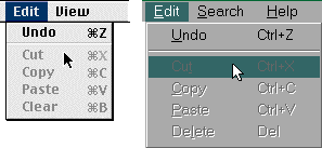
About the biggest difference (other than the fact that Windows takes twice the screen real-estate as the Mac to display the same thing) is how displaying which menu item is being selected at a given time. When you move over a menu that is deactivated on the Mac (meaning you can't issue that command) the menu does not highlight (or show a selection) -- this is because selecting that command will do nothing -- visual feedback. When you move over a deactivated menu item with Windows, the menu highlights -- this is confusing since that implies that you can "issue" that command. Even more confusing is that clicking on this will do nothing, I mean the menu won't go away. People wonder if they clicked (or released), so they do it again -- still nothing. They have to click somewhere else to make the command go away. In interface lingo, the selection is saying "hey, I'm a valid command" -- then there is no feedback or implication as to why it won't work. While the Mac is visibly showing that selecting that item won't do anything.
Mac - The Mac uses a special font for menus, and a 3D look (MacOS 8) to differentiate the menubar, and pop-up menus have a special frame (and arrow) to denote them as a menu. There is a high-contrasting platinum look, and can use Icon's (ugly) or small icons (better) to help differentiate some items. The command keys are differentiated for clarity (to the right) with a special symbol. The text is clear, the hierarchy arrow is large and visible -- SCORE: 4
I would personally think the Mac is just a tad better than the others, because it uses an arrow to distinguish pop-up menus (and hierarchical menus), the rounded corners on menubars make them a little more clear/distinguishable, and the Mac uses higher contrast than the others. Also the Mac has the richest ability to replace the look of UI elements, including menus. But all this is just personal preference, and not likely to dramatically change the "usability" of the look.
NeXT - NeXT has menus with each item having a 3D look. This makes it easily distinguishable, and appealing. It is slightly lower contrast than the Mac, but not enough to disturb, and NeXT started the 3D look that Apple later copied. The text is clear and readable, and overall the look is as good as the Mac (or at least close enough) -- SCORE: 4
BeOS - in general, one thing Be did not skimp on is esthetics, the UI looks really clean and nice (overall). Unfortunately, there is not that much you can do with Menus beyond what has already been done (decades earlier). The menus are clear looking, and have a nice, readable, bold font. The hierarchy arrow is a little too subtle for my tastes, and it is not too easy to tell the difference between a button and a pop-up menu (the lack of an arrow makes it harder to tell). There are some subtle small icons added in certain case, that give it a nice look. Overall, it has a sexy look, and is basically as good as NeXT and the MacOS -- SCORE: 4
Windows - Microsoft usually values esthetics (often above functionality), but in this case they fell just a little short. There is nothing (visually) to differentiate their menu items from other text, other than a little line under some character to denote (one of) the keyboard shortcuts. The text is plain sans serif font, that is not as clear as any of the other Systems (which use bolder fonts), and Windows uses the same font elsewhere. Un-selectable menu items are given an annoying low-contrast 3D effect that makes them hard to read. It is sometimes hard to see what is a menu (or popup menu), and distinguish that from other elements There are rarely differentiated shortcuts (like Control x,c,v for cut copy and paste, or alt-functions), but all items have the underlined items short cut (which work with a two step shortcut process which is far less clear). The hierarchy arrow (triangle) is plainly visible -- SCORE: 3
NOTE: Under Windows98, Microsoft added some animation so that menus actually slide down (like "blinds" on a window) -- but I find the effect annoying and somewhat slowing, and it does nothing to address the problems of clarity.
|