![]()
Advocacy
Dojo (HowTo)
Reference
Markets
Museum
News
Other
![]()
Myths
Press![]()
General
Hack
Hardware
Interface
Software![]()
Standards
People
Forensics![]()
Web![]()
CodeNames
Easter Eggs
History
Innovation
Sightings![]()
Opinion![]()
Martial Arts
ITIL
Thought![]()

![]()
![]()
![]()
|
There are some new behaviors in Aqua. I care about the look a little, but I care about the feel and features a lot. The feel is what is going to make the interface usable or not. Aqua has a few behaviors that borrow from browsers -- and some things that look a bit like Windows2000. So let's discuss some of these issues.
Browser-like
Windows98 (with active desktop) and Windows2000 are both going to a more browser-like interface. To a point this makes sense since web browsers are probably the single most used application for computer users today (and into the future). Many users are trained for using them -- and so making the computer behave more like a browser is making things easier and more consistent. In others ways there are some pitfalls to avoid. Browser are pretty bad interfaces -- and they have few and poor standards for the ways things with look or behave, and they don't have nearly the power of a desktop metaphor. So what designers need to do is adopt a few of the good and common behaviors, things people have come to expect, while not limiting themselves in how things work.
It is very easy to do things wrong. After playing with Windows2000, I was quickly annoyed by some of the interface. There just wasn't enough visual queues as to what was going to happen -- and it took too long to change behaviors (operating modes). Then too many surprises and quirks. Subjectively, it was a web browser in most of the ways I didn't want it to be -- and I was able to count on the usual Microsoft way of making simple concepts complex. Some concepts were interesting -- but I don't like how many were implemented.
Apple seems to be borrowing from the browser as well -- just a little more conservatively, with more visual queues, and they seem to be trying harder to integrate the browser behaviors with the regular behaviors, rather than having different modes for the interface. This seems to work a little better -- but time will tell.
Browse in place (single window)
"Browse in place" is a concept that predates web browsers
by a decade or two. Browse in place is the idea that when
you click on a folder (or for a browser when you click on a
link) you don't open a new window with the new contents, you
just replace the current windows' contents with what is in
the new window (or at least you put the new window in the
exact same position as the old one). The user changes
"levels" but nothing moves (e.g. everything stays in place).
The standard open and save dialog (standard file dialog) in
the Macintosh is a form of browse in place -- when you open
a folder, it replaces the current content with that folders
content (without opening a new window). Most new users know
of browse in place because it is the common behavior used in
browsers -- they keep going into links, and back, without
the window changing, and only the content changes.

In Aqua, there is a new window control in the upper right hand corner. It is a little clear bubble -- but if you select it, it turns purple which basically means "only one window" and "browse in place". It will place all the other windows (except itself) into the dock. From that point on, any window or sub-window that you open will replace the same position of the window you are in (and place the old one in the dock) -- basically you are browsing in place.
This interface has a few advantages -- the most important being that it is a way to maximize screen real estate, and fill it with the contents of any one file. With the dock, this allows users to quickly navigate between many files/states. And if the user chooses they can click the little purple pimple again, and they are back to opening new windows for everything and the normal desktop metaphor.
Technically, this is a way to take a modeless window interface (like the Mac) and turn it into a state based interface. This is a neat thing for new users -- and can be convenient for the rest of us, occasionally. Long term, time and usage will tell how useful it is.
Back
One of the issues with browse in place is that users often want to go back to where they came from. If they accidentally go in an extra level, or click a link by mistake, or they are finished with a particular level, then the most common thing the user wants to do is go back. Because of that, web browsers normally have a back button, and even in the Mac the standard file dialog has a little menu that has the history of places you've been (all the way to the top directory / desktop). Well, in Aqua a browse in place window also has a little "back" triangle (to the left of a favorite places popup menu) that lets user go back (go up a level) -- just like a browser. This is an easy concept to train users on -- and can help users with their work. So I like that metaphor and control -- and think it will be easy to train users on.
Mouse roll-overs and activation
Another web-like interface element is roll-over controls. When you bring the mouse over some controls they change state/color to show where you are, and what will happen when you click. This is common in websites -- and now may become more common in the interface.
I have no problem with roll-overs -- they can show users what will happen, or that something will happen if they click. The problem is that you have to be consistent. If a roll-over shows that something will happen when you click this control (by showing detail, or changing color) in one place/control, then you have to do it to all controls where a click will do something. Consistency is the biggest key to good interface -- otherwise users are left trying to guess what that behavior means, and why it isn't doing the same thing elsewhere.
In Aqua, an example of this is the window controls for close, minimize and maximize -- they will show more detail (little symbols inside themselves) when you move over them. This isn't bad -- but what about all the other controls. It is possible that things aren't finished yet -- but if you start something like that, then you have to finish it -- and do it everywhere.
Someone on an HI (Human Interface) list was discussing the possibilities and animations. Since the interface is using animation to denote some things (like the default button in a dialog) -- then why not take that behavior further. So window controls probably should just change color, but the one you are over should show a little animation to try to show what will happen if you click on it -- like the close fades out, the minimize gets smaller, and the maximize grows, thus each trying to convey what they do.
The other thing it Aqua does with window controls is that if you roll over a background window's controls, they not only show more detail, but change color to show they are active. That behavior is also neat -- if it is done everywhere. That means that the growbox, and browse-in-place control have to do the same thing and so on. It is a little peculiar that all the controls go active at once (not one at a time as you are over them) -- but there seems to be a good foundation of an idea there, we just need all the spit and polish, and making everything consistent.
The last behavior is an "activate" effect. Like scroll controls on the Mac, or better websites that use animations -- a far more important behavior than having controls change color to show that something will happen when you click on them (activate them) -- you also need controls to give the user feedback that they have been activated. In many cases these states exist for only a fraction of a second (until things are updated), but in other cases they hang around (like on the Mac dragging the thumb, or clicking on the up or down scroll arrow -- they change shade to show that they are activated). Roll-overs can work (if subtle) -- but you also need the far more important activation states. I couldn't tell all the activation states for the new interface, and just want to make sure that the form (glitzy roll-overs) doesn't take precedence over function (activation highlighting).
Multicolumn browser
There is another feature of the NeXT browser, which is the column mode file browser. I've used it on NeXT, and found it useful. Windows did a poor job of ripping that off as well (with their file browser) -- I find NeXT browsers behavior far better over all. For tunneling into hierarchies and browsing around it is a really nice interface.
The way it works is that you pick from a list (column) in one level, and the next level (column to the right) shows your selections contents. Then you can select something in the next column, and the column to the right will show you new selections contents. Very easy behavior to explain. Now with the improved Aqua browser, it can even show previews in place to help you find things even faster.
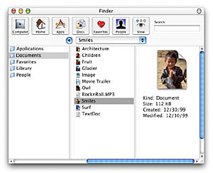
The best thing about the multicolumn browser is that you are able to view the history (of where you came from) in much more detail than the browse-in-place metaphor. You can not only see what is in the folder (level) you are in, but also see what is in each of the parent folders, right up the hierarchy. It uses more screen real-estate -- but for some browsing this can increase speed and usability. In general, power users like the feature -- and it is not a hard behavior to teach newbies.
What about the finder?
This multicolumn browser is part of the new finder. There are still ways to use traditional "Mac" browsing, and behaviors that have not yet gotten into this NeXT-like replacement -- there are a lot of things the Mac Finder does. Many of these subtle behaviors are very powerful -- and so Mac users will be very concerned about losing those features.
One glaring omission (so far) is spring loaded folders (folders that popup when you drag over them). This is a very powerful feature that makes navigation (for power users) far easier. I have no idea how this would even work with some of the new views of Aqua (column view mode) -- but I do know it is a feature I don't want to give up. Others might include going back up file hierarchies (command clicking on a windows name), popup windows, customizing icons, and so on. So there is still a lot of questions.
The Finder and the desktop metaphor are one -- and they help make the Mac what it is. I already mentioned the desktop in the previous article [Dock/Desktop], but it needs to be reiterated that the desktop and the Finder are different aspects of the same thing -- and we are losing it in the demos of Aqua (so far).
I've used the NeXT browser quite a bit, and for somethings it is very nice -- for others it is a step sideways (or backwards). In NeXT (or at least OS X Server, and Rhapsody) there were quite a few subtle problems with the multicolumn browser. You could drag files inside of columns (they would be shown in a top area, and you had to drag those), but you could double-click them, and other little quirks. It is a mediocre interface at best for copying files (since you have to open two browsers and drag between one to the other to do a copy). And the default behavior is to copy files in the same hierarchy, instead of moving them (like on the Mac -- and which is the more desired behavior) -- and so on. In some ways it is better, more ways it seems worse, and in many ways just different. Despite the negatives it was still quite usable, even if some behaviors were only half complete. The important thing is that it appears that all those behaviors are being improved and "finished" for Aqua -- and that will make it more usable and intuitive. Or at least Apple is trying. So Apple seems to be doing their best to add as many of the older finder behaviors in as they can -- while still fixing the behaviors they had (and that could be easily improved. So even if they aren't quite "there" yet -- but the important thing is that they are progressing.
Conclusion
There are three basic modes for navigating a hierarchy.
- Opening a new window for each level
- browsing in place
- browsing while showing the history
The Mac did the first mode the best of any GUI in existance (that I know of).
The second, the Mac did well in certain cases (like standard file dialogs) - but didn't utilize as much as it could -- and most other interfaces didn't utilize this behavior well either. In this area the NeXT ways were better at this -- but they had some quirks as well. In Aqua the new browse in place control, and extending that behavior will probably come in handy and extend this behavior very nicely.
The last behavior is browsing while showing the history of where you came from. This is where the Mac was weakest -- and what the NeXT interface did best. Adding this mode alone is very useful and should help some users work with their data quite nicely. Fortunately Aqua has behavioral improvements over even the NeXT browser -- and this behavior is also especially nice as a mode for Standard File dialogs (or finding files in a hierarchy). So I'm really glad to see progress.
There are still quirks and issues -- and the key to a good interface is consistency. UI people have a lot of concerns to make sure that even though there are a LOT of changes coming in the new interface, that consistency doesn't suffer. So while I like many of the new behaviors, and look, it is my job as a UI person to pick nits, and make sure that the behaviors are used everywhere, and things "fit" right.
Interfaces can be well below the perfectionist interface-geeks standards and still be usable, heck look at Windows. Despite Windows being complete garbage when it comes to interface and consistency, it is still quite usable for a lot of people. So we want interface to matter more than it actually does to most people (casual users). Humans adapt to bad interface all too readily. Mac do care more about interface, and tend to understand it better -- and so they just want to make sure that their interface (or Aqua) doesn't devolve into something more like Windows. But even if Aqua is only a better Windows (instead of a better Mac) -- it will still be quite a usable interface, and better than the alternatives.
|